The Dust & Scratches filter is simple but powerful–if used correctly, which it often isn’t. Properly controlled, it’s not just a noise reducer but an excellent method for smoothing out fleshtones in a natural way.
The name is deceptive. People think some kind of analysis is going on that picks up what is noise and what is not. We start with an artificial example.

1A and 1B: The Dust & Scratches filter at its best.

1A and 1B: The Dust & Scratches filter at its best.
The five white splotches are supposed to represent noise, which the Dust & Scratches filter is supposed to find and eliminate. It works perfectly! The noise is gone undetectably, yet the edges have been honored and are just as sharp as ever.
There is, however, a slight catch, as you will notice when we zoom out.

2A and 2B: The Dust & Scratches filter at its worst.
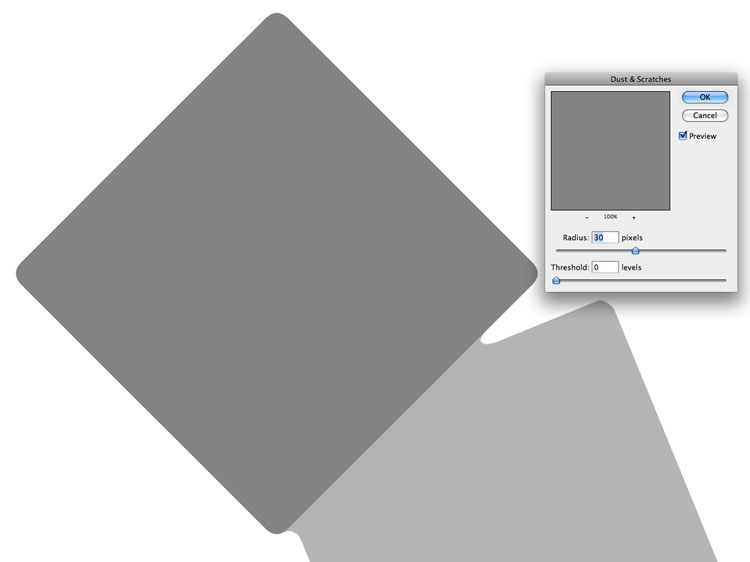
2A and 2B: The Dust & Scratches filter at its worst.
This is supposed to be a noise reducer, not a tool to round off corners. But that’s what it’s done. And there is a particularly ugly artifact where the two shapes meet to the left and below the dialog.
Contrary to conventional wisdom, there is no attempt to determine what constitutes noise. The Dust & Scratches filter is nothing more than the old Median filter, with the addition of the Threshold field. If Threshold is zero the two filters function identically.
A “median” is normally thought of as a type of average, but when we use the term “average” (and Photoshop has a filter by that name) we are talking about the mean, not the median. The difference is this: given the numbers 5, 20, 25, 100, 250 the mean is 80–the sum of all five numbers divided by five. But the median is 25–it’s the middle number. Two are higher, two are lower.
Suppose we select the shape and run the Average filter. The result is that the splotches disappear but the shape gets slightly lighter. This doesn’t happen with Median or Dust & Scratches, provided the Radius is set high enough. The overwhelming majority of the pixels in this shape are gray, not white. Consequently the median pixel value is a gray, and that’s what replaces the white blotches.
Provided, that is, that the Radius is high enough.
In principle, the Radius of 30 tells Photoshop to replace each pixel with the median of the 900 pixels (30×30) around it. Any 900-pixel area within that shape is mostly gray. The 45th-darkest pixel will necessarily be gray, too. But if the Radius were only 3, then Photoshop would only be looking at 9 pixels. And in the center of the splotches there wouldn’t be much change, because the 9 pixels that surround them are mostly white and therefore the 5th highest value–the median–is white also.
Straight edges present no problem. In Figure !, consider a point, say, one pixel inside the gray shape. You might think it would get blurred because of the proximity to the white background, but it isn’t so. Yes, if you look at the 30 pixels going away from the shape, 29 are white–but one is gray. And in the other direction all 30 are gray. With only two possible values to choose from–white or gray–the slimmest majority wins. So the pixel remains gray.
Where two edges meet, however, Dust & Scratches normally fails. The corners are lopped off, because they are surrounded by more white than gray pixels. A particularly ugly artifact develops where the light gray shape intersects the dark gray one. For present purposes it’s enough to know that what is happening between the two shapes is very bad; but for extra credit you can ask yourself why it is that the artifact is light gray rather than dark gray or some combination.
We need to be on the lookout, therefore, for irregular shapes, especially those that have V-shaped areas that might provoke misconduct on the part of the filter. The following, a formation known as Devil’s Garden, is full of such irregularities on the sides of the hoodoos and also in their shadows.
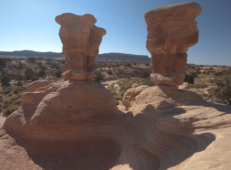
3A: These hoodoos have the types of edges that are problematic for Dust & Scratches
To show the lurking danger, I apply the Dust & Scratches filter at a high radius to the green channel only. Everyplace you see bright purple, the green channel has expanded into an area that it doesn’t belong. Bright greens mean it has contracted.
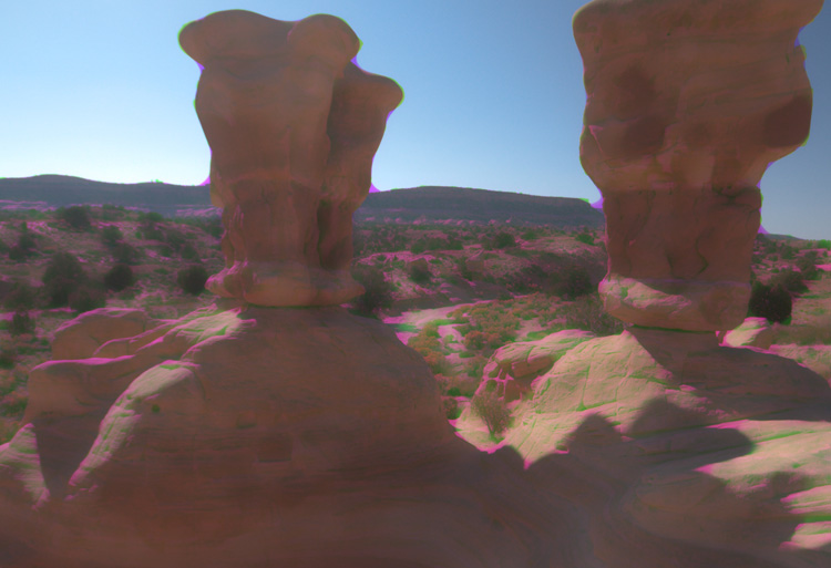
3B: Dust & Scratches has been applied at a high Radius to the green channel only. Note the magenta defects wherever there is an indentation in the rocks.
The V-shaped indentations in the rocks are being filled in by the filter. If we were really applying D&S the chances are it would be to reduce noise in the sky or the foreground. Either way, we might overlook these defects in other areas, only to discover them ten steps later when they are difficult to get rid of.
Because so many people have unexpectedly been afflicted with this problem they have reached the conclusion that Dust & Scratches can only be run with a Radius of 1. The artifacting effect will still be there, but likely so small as not to be noticeable.
In fact, running at a higher Radius is often worthwhile–provided you make a selection, or a Blend If, to prevent these artifacts from occurring.
Dust & Scratches and Surface Blur
These two filters are the most flexible options for reducing noise, but they are hard to keep straight because their Threshold fields are opposite, and neither works the same way as Threshold in Unsharp masking.
All three filters do some blurring (USM does so invisibly, in the background), but the three blurs are technically different. Unsharp mask uses the Gaussian blur filter to start its operation; Dust & Scratches a median, and Surface Blur some other algorithm. Understanding the differences in blurring isn’t important, but understanding the three Threshold functions is. They are:
Dust & Scratches: Threshold of 0 has no effect and makes it identical to the Median filter. If Threshold is >0, the filter ignores any pixels that would change by the amount of the Threshold or less.
Unsharp Mask: Threshold of 0 has no effect. If Threshold is greater than or equal to the change caused by the sharpening, the pixel is ignored, but, unlike Dust & Scratches, there is also an impact on pixels where the difference is greater than the Threshold.
Surface Blur: Threshold of 255 has no effect. If Threshold is less than or equal to the change caused by the blurring, the pixel is ignored.
Now let’s do this in English instead of Geekspeak. Forget Unsharp Mask; this article is about blurring. And Surface Blur and Dust & Scratches both do that. The difference is:
*Dust & Scratches lets us ignore small variations on the theory that they probably aren’t noise, while blurring out bigger variations.
*Surface blur lets us ignore big variations on the theory that they probably represent an edge, which we wouldn’t want to blur.
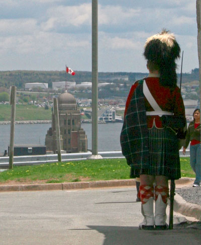
4A: the original for the following exercise, at reduced size.
You can see the limitations already. Unless you use a very narrow Radius, Dust & Scratches will require a selection, otherwise edges will be lost. And Surface Blur will need to be run at a low opacity or everything will look blurry.
So, which to use? You have to analyze the specific problem. If what you see is actual noise, or the equivalent–that is, a few weird pixels that are messing up an otherwise acceptable look, think Dust & Scratches. If you are trying to soften generally, think Surface Blur.
This decision is sometimes more difficult than it sounds. It is also sometimes a matter of taste. Faces don’t look lifelike if they’ve been blurred, but they often have visible imperfections that tend to be well off the average value. To minimize them without taking the pore structure with them, Dust & Scratches is ideal. But some art directors reject the natural look. They want a plastic-like skin texture in younger female subjects. I loathe and despise that look myself, but if the client wants it then Surface Blur is the best way to get it.
Skies can also go either way. Let’s try an example, but first some basic rules, for either filter:
*Always start with the Threshold maxed out, and determine what is the minimum Radius you can get away with.
*When the proper Radius is determine, then find the most conservative Threshold that will get rid of what you’re trying to get rid of.
*Unless the correction is small, if time permits you will get better results by doing one pass to eliminate darker defects and a second to eliminate lighter ones.
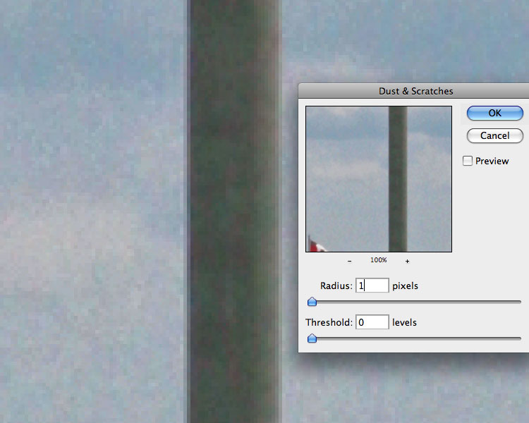
5A: The original sky (note that preview has been turned off).
In the above original, would you say that we should try to reduce gross defects–which suggests Dust & Scratches–or just soften generally, with Surface Blur? Let’s try it both ways. With Dust & Scratches we start by setting Threshold to 0 and finding out what the minimum Radius is needed to get rid of the noise.

INSERT CAPTION
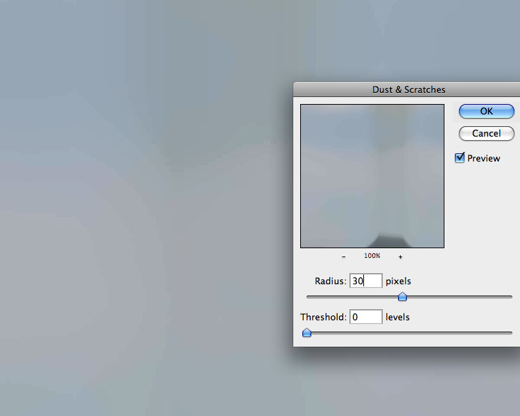
INSERT CAPTION

5B, 5C, and 5D: Choosing the proper Radius. Threshold should be set at 0 during this procedure.
Any magicians needed to work on their disappearing-flagpole act would doubtless welcome the news that the Dust & Scratches filter, with a high enough Radius, will take care of it for them. While erasing the flagpole is doubtless excessive, the Radius of 1 is not getting the job done. It’s not just a matter of grainy noise; there are blotches, too, some of which are of a different color. After a couple of tries, I settled on a Radius of 6, as shown in 5D.
This looks too blurry, so now that we know the proper Radius, it’s time to adjust the Threshold. Remember, the Dust & Scratches Threshold permits fine variations, not coarser ones.

5E and 5F: Once the proper Radius has been determined, adjust the Threshold to reduce the perception that the file has been blurred. A higher value permits more texture.
How far to go here is a matter of taste. I don’t think leaving the Threshold at 0 is acceptable. I vote for 3. I show 6 to indicate what happens when the value goes up. I don’t care for it, but notice that it still isn’t as noisy as the original, and it certainly doesn’t look like somebody has blurred it.
Now let’s try the Surface Blur alternative, starting from scratch. We start as before with a trial to find out the proper Radius, but this time the Threshold gets set all the way to the right, to 255.
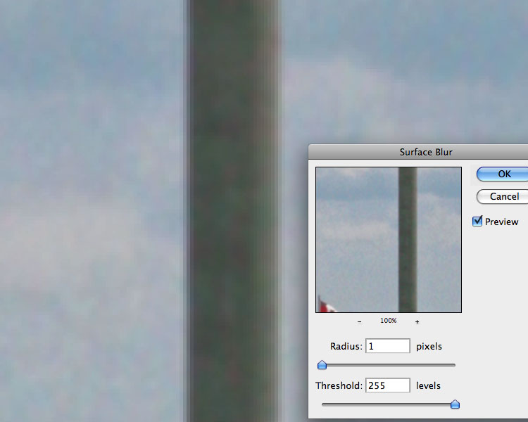
INSERT CAPTION HERE
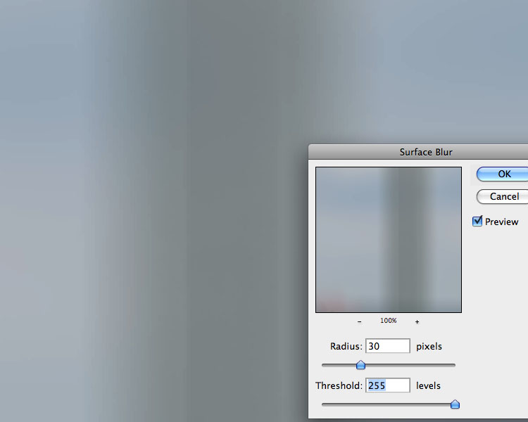
INSERT CAPTION HERE

6A, 6B, and 6C: Finding the proper Radius for Surface Blur, with Threshold set to maximum.
This gets more or less the same effect as Dust & Scratches with Threshold of 0. But now the food for thought questions:
*Since the blurring Radius appears to be about the same in each filter, why does a Radius of 30 obliterate the flagpole entirely in Dust & Scratches, but merely defocus it with Surface Blur?
*Similarly, with a Radius of 5 or 6, why is the flagpole so much sharper with Dust & Scratches?
Strictly speaking you don’t need to know the answers–but it can’t hurt to think it through (on your own time). Back to work, though. We now adjust the Threshold downward as far as possible without restoring the noise in the sky. Now the effect is the reverse of Dust & Scratches–we retain big transitions and blur only the small ones. One thing can be predicted for sure: the difference between the sky and the flagpole is many times greater than between normal sky and noisy sky, so once Threshold comes down the flagpole won’t be blurry any more.

6D: Reducing Threshold in Surface Blur protects edges, such as the flagpole.
We now have to avoid the blurry look. Since Surface Blur’s Threshold doesn’t let us do that the way Dust & Scratches can, we are reduced to putting it on a layer or using the Fade command to reduce the overall effect.
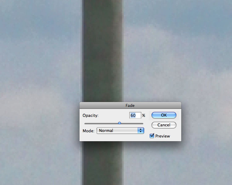
6E: The effect of Surface Blur has to be reduced somehow, or the image will look defocused.
So, which method wins? The contestants are 5E and 6E. I find it hard to pick; they’ve both done a reasonable job of getting rid of the noise without making the shole sky look blurry. The Surface Blur is a bit softer, which is probably OK, but it has left in a little more color variation than Dust & Scratches did. What goes on in the rest of the picture, however, makes my vote a foregone conclusion.
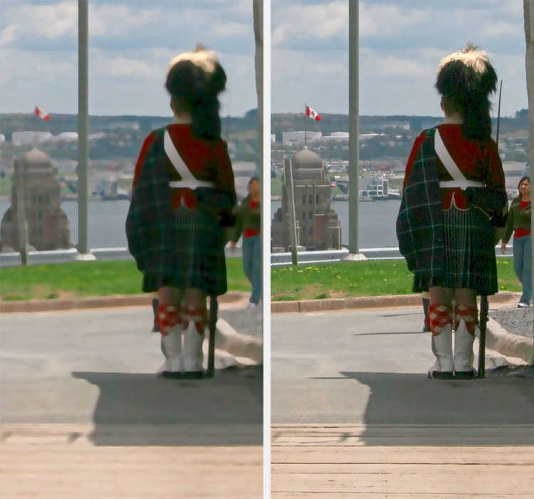
6F: The bottom half of the picture. Left, using the Dust & Scratches settings of 5E. Right, using instead the Surface Blur settings of 6E.
A certain amount of aggravation will be needed to get rid of the disaster in the bottom half of the Dust & Scratches version. The Surface Blur version, on the other hand, is almost OK as is. If we want to reduce or eliminate the blurring effect on the bottom, we need only lasso the bottom half and fill a layer mask. The selection doesn’t have to be made carefully because the edge between sky and background is excellent. This is more than can be said for the Dust & Scratches version.
Light and Dark Defects
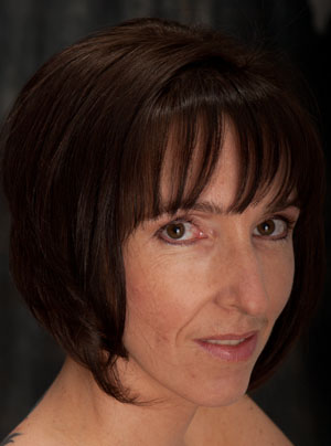
7A: A studio portrait with skintone issues.
The foregoing example had real noise and was shot with available light by an amateur. When the image comes from a professional studio noise is unlikely, but the technique still works. And it works particularly well with faces.
The subject of the studio portrait in 7A is clearly mature. An overly smooth skin texture is not appropriate. But there are blemishes and other imperfections. This calls for Dust & Scratches, not Surface Blur. It also calls for handling light and dark defects separately. Dark defects are usually larger than light ones and it’s a good idea to eliminate them as completely as reasonable. Lighter defects sometimes shouldn’t be killed altogether. The reflections in this woman’s lips and above her nose are defects, yes, but I would rather reduce than eliminate them. The bloodshot eye is a different story. That is, of course, a dark defect.
The woman has two large blemishes and one smaller one. In real life, these should be cloned out. However, for the sake of the demonstration I will not do that, nor will I make a selection. Here goes, with the initial objective being to eliminate the darker defects.
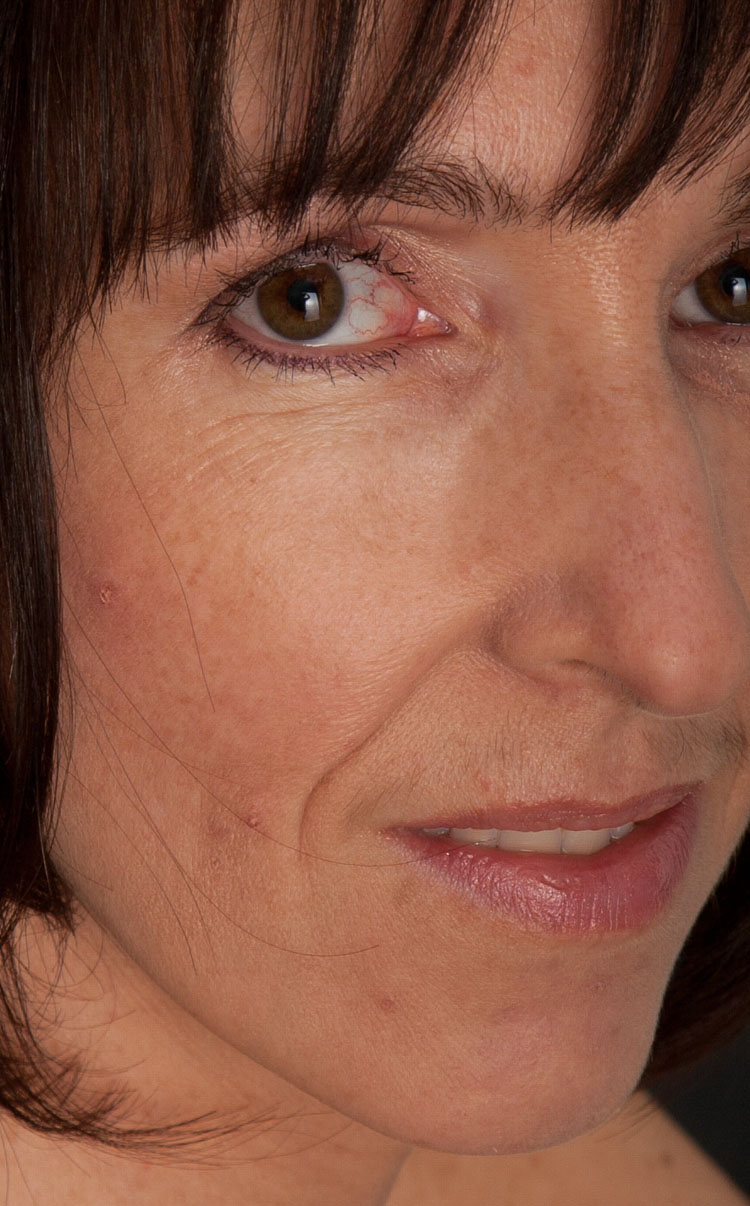
8A: The original capture

8B: A test to choose the proper Radius for Dust & Scratches, with Threshold set to 0. This is my choice, a Radius of 10.
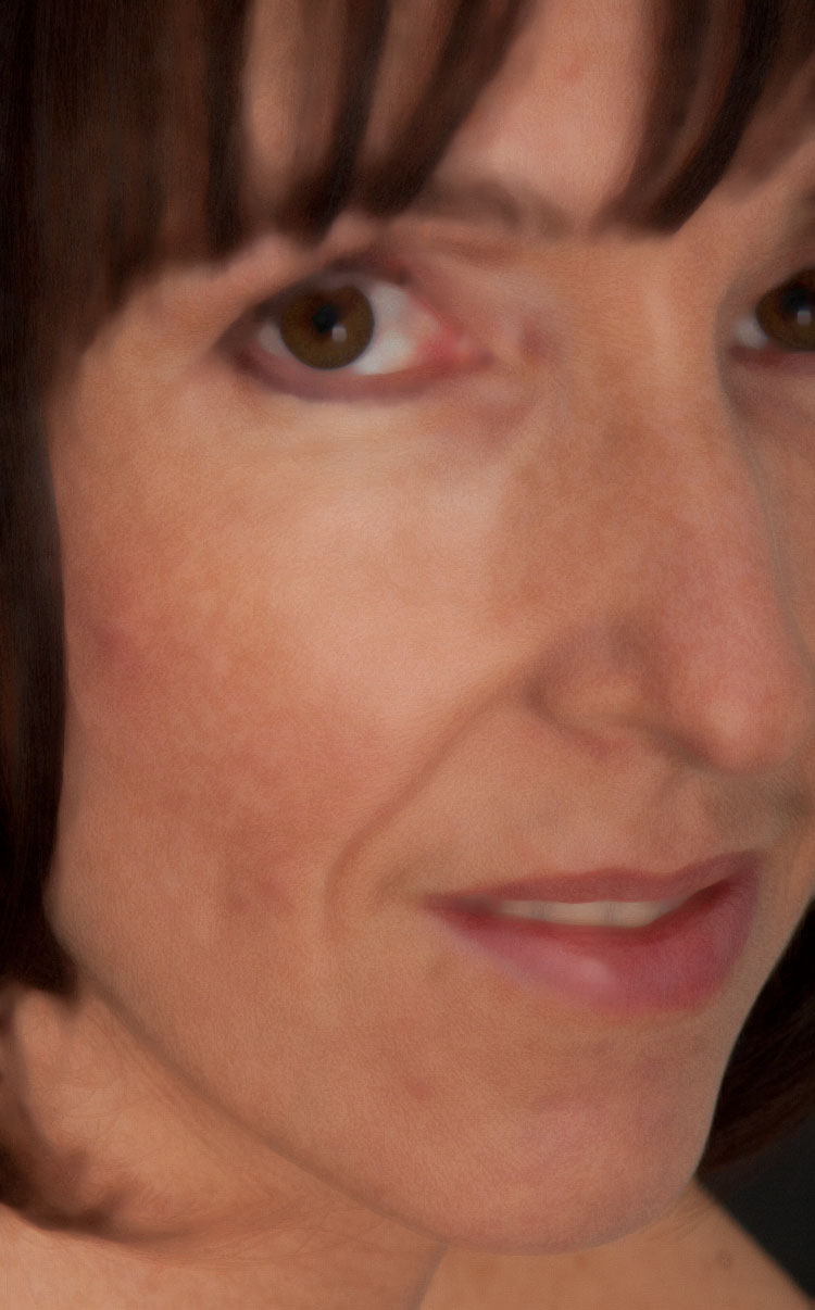
8C: Having cancelled the test, I now choose a Threshold of 8 to go with the Radius of 10 that I previously chose.
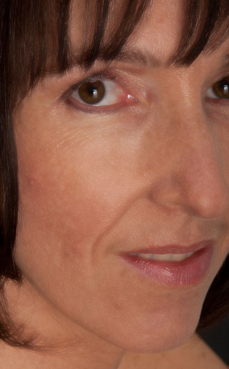
8D: The filter of 8C is changed to Lighten mode, preventing anything from getting darker and therefore restoring the light defects.

8E: Working on a composite of the previous corrections, a second pass of Dust & Scratches eliminates the light defects. Because they are so much narrower than the dark defects, a smaller Radius can be used. This pass was Radius 3, Threshold 7.
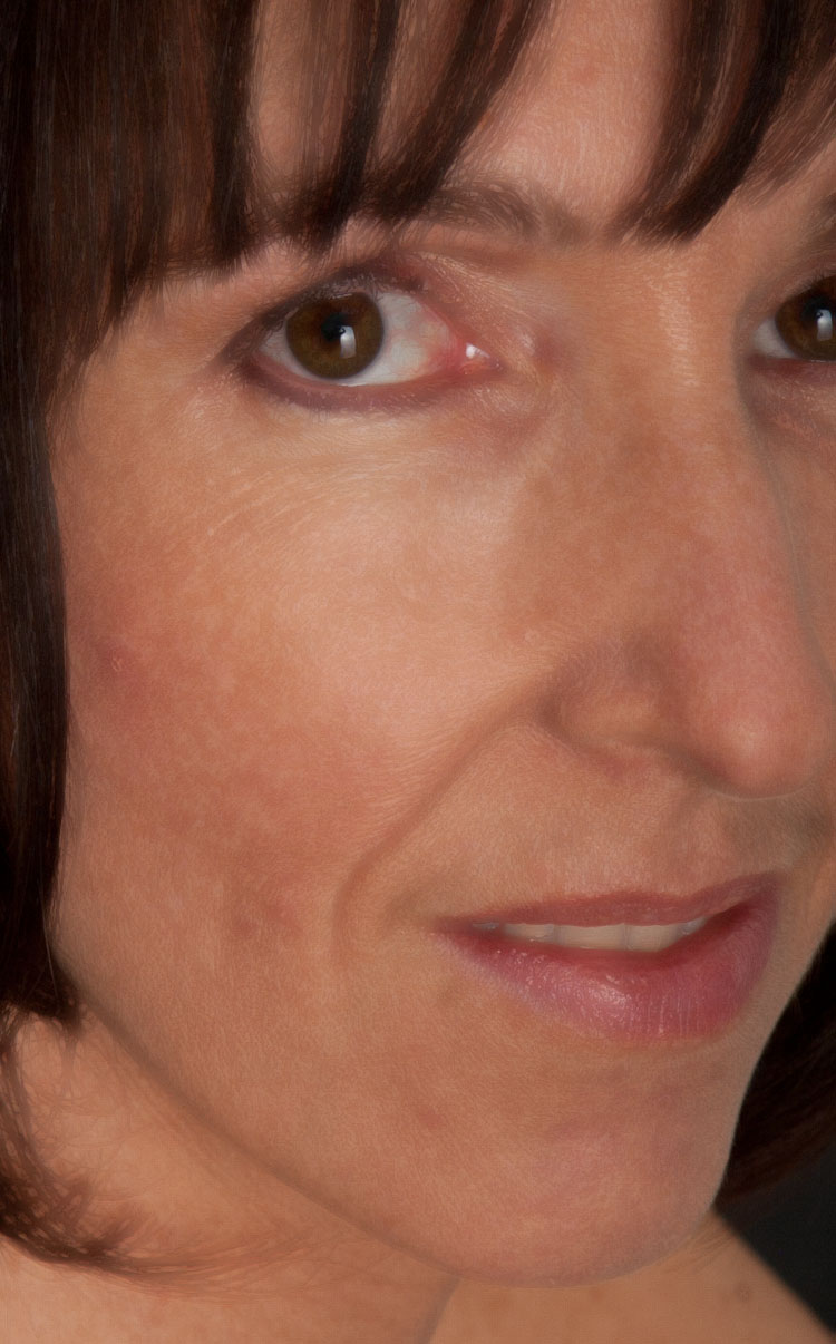
8F: The previous step is reverted to 50% opacity, restoring some of the reflections. Compare this version to 8C to see the merits of filtering separately for lightening and darkening.

8G: A Blend If using the red channel restores the original hair, eyes, and lashes.
As you can see, Dust & Scratches is not quite as blunt an instrument as some people think. If used carefully, it can be a good friend.


{ 0 comments… add one now }