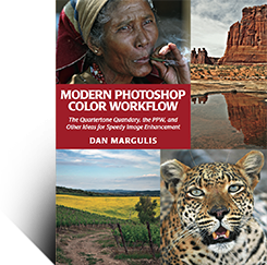
We’re now two months out from publication and according to me all is going well. Those readers who have signed up for video access get a series of canned e-mails from me and a surprising number have taken the time to respond personally. So far, all reactions are positive. Also, it really looks like everybody knew what they were getting into when they bought the book. People comment on the difficulty but they say that’s what they wanted.
People by and large are heeding the advice that skipping around in the book makes a lot of sense. Also, all comments about the two-part structure of the chapters have been positive. I had worried about this a good deal. I had copied that structure from Photoshop LAB Color, one half aimed at non-experts and the other assuming a lot of technical skill. But the first halves in the new book are tougher than in the earlier one. The only easy part about them is that they don’t require much Photoshop knowledge, but the concepts themselves can be plenty difficult. So I wasn’t too sure about how things would go over, and am relieved by the response.
During preparation of the book readers disagreed about which chapter was the hardest. I am clear in my own mind that it’s Chapter 3, dealing with initial color curves. The other color correction instructors in the beta reading group agreed. Some other readers both then and now felt that the contrast moves of Chapter 4 are tougher. Fortunately, nobody thinks that the color enhancement moves of Chapters 5 and 6 are difficult, although they are the most spectacular part of the workflow.
A reader who felt Chapter 3 was too tough posted to the appliedcolortheory group asking where simpler information was available about curves. Other members responded with a series of useful links, so I’ve posted the whole thread.


{ 0 comments… add one now }